CHROMAYOGA
Role. Founder + Creative Director
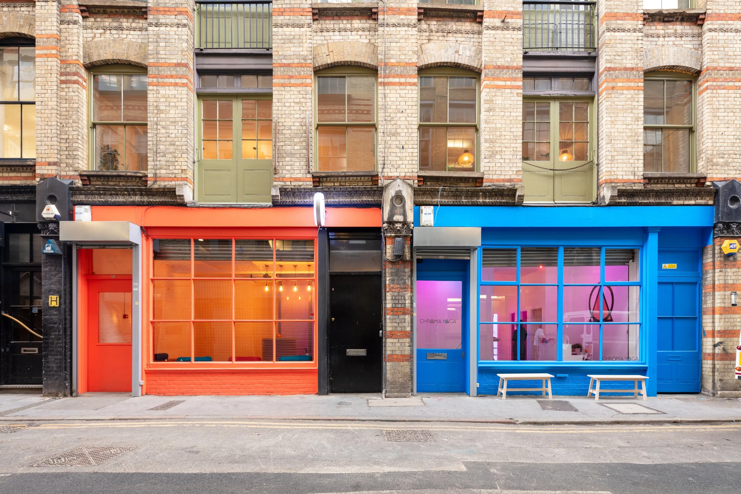
In 2016 I founded ChromaYoga — the first studio in the world to integrate coloured light into its spatial design. Drawing from immersive art and light therapy, the concept combined colour psychology, custom soundscapes, and bespoke scents to create a multi-sensory environment tailored to different styles of practice. It gained traction quickly, appearing in multiple global trend forecasting reports as a leading case study for the future of user experience in leisure and wellness. What started as a single studio has since become a reference point for an approach to sensory design that's now widely adopted across the fitness and wellness industry.
Campaign Imagery
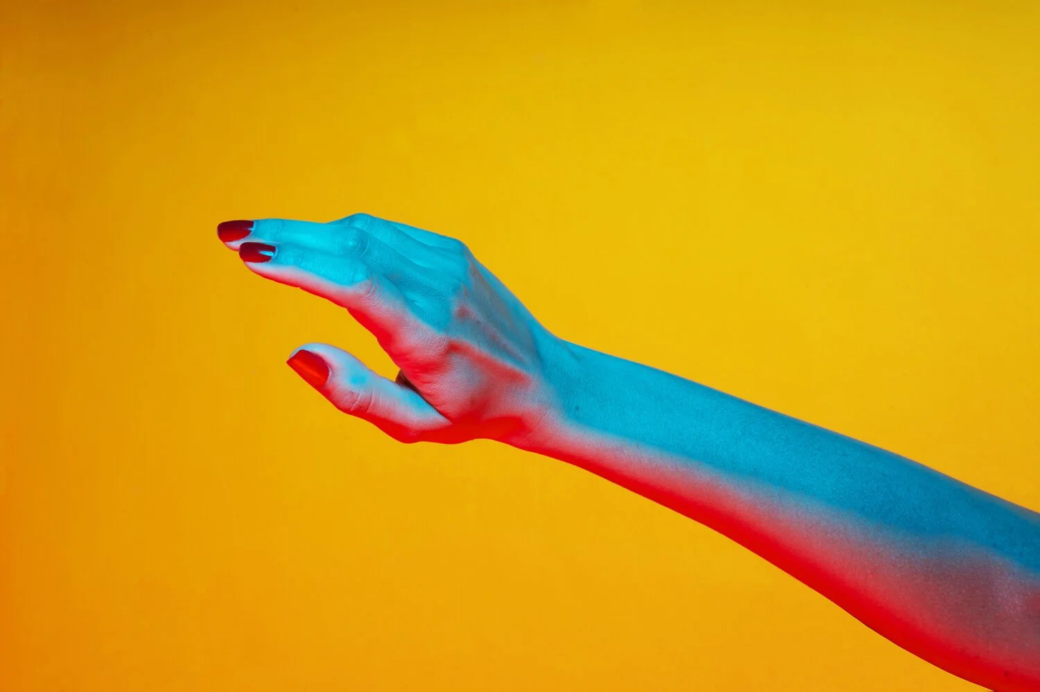
For the campaign imagery I wanted to stay as far from conventional yoga photography as possible. Rather than polished poses and aspirational composition, the focus was on colour — the way it hit the models' skin, the shapes their bodies made in the light. I was drawn to the twists and bends of limbs, the moments that felt human and slightly imperfect, as a deliberate pushback against the corporate, Instagram-ready version of what yoga is supposed to look like.


Studio Design + Build
I collaborated on the design of both studios, taking the work through from early concept into the physical build — making material, colour, and fixture choices, and project managing the process throughout. It wasn't always linear; when problems arose mid-build, quick decisions were needed and the design had to adapt on the fly. That ability to hold the creative vision while responding practically to what was in front of us was as much a part of the work as anything that happened at a desk.


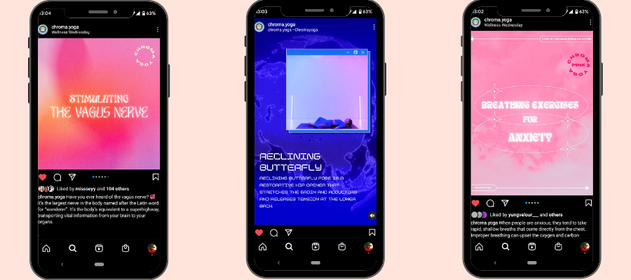
Socials
The social strategy was less about yoga content and more about building a visual education around colour and light. Rather than poses and wellness clichés, we curated the work of painters, photographers, and designers — posting their work alongside writing about the image, the artist, or the ideas behind it. Woven into this was original educational content on colour and light therapy, and imagery of our teachers in the studio. The result was a feed that felt closer to a moodboard than a fitness account, which was exactly the point.